
AI Painting Aspect Ratios: Choose the Right Canvas First
Style usually gets the attention in photo-to-painting workflows. People talk about watercolor, oil paint, or Van Gogh effects first. The canvas shape often matters earlier, because it decides what stays in the frame before the style has any chance to work.
That choice is easy to overlook on a site where the flow feels simple: upload a photo, pick a painting style, choose a ratio, and generate. But a better crop inside the photo-to-painting generator can make the same source image feel calmer, richer, or more focused before any brush effect is added.
The goal is not to memorize technical numbers. It is to pick a canvas that supports the subject you want the final painting to emphasize.
Why Canvas Shape Changes the Painting Before Style Does
A painting ratio changes the visual story by controlling how much space the subject receives and how much background survives. A vertical frame can make a person feel central and intimate. A wide frame can make the setting feel just as important as the subject.
That means ratio choice is really a framing choice. If the crop cuts away the best part of the photo, no painting style will fully rescue it. If the ratio supports the subject from the start, even a simple style can look more intentional.
This is especially important with photo-to-painting tools. The generator is not creating the subject from scratch. It is transforming an image that already has a composition. Ratio selection changes how that composition is interpreted.
What Aspect Ratio Actually Changes in Photo-to-Painting Workflows
The ratio does not only resize the picture. It changes the amount of breathing room around the subject, the tension between foreground and background, and the kind of painting mood the result can carry.
Why 3:2, 4:3, and 5:4 do not feel the same
The Library of Congress glossary defines aspect ratio as the ratio of horizontal to vertical dimensions of an image. It gives still-image examples such as 3:2 for a 35mm slide frame, 4:3 for TV, and 5:4 for 4x5 film. Those shapes may sound close on paper, but they do not feel the same once a subject is placed inside them.
A 3:2 frame often feels natural for everyday photography because it leaves enough room for the subject and some surrounding context. A 4:3 frame feels slightly boxier, which can help when the image needs balance without becoming too tall. A 5:4 frame feels tighter and more formal, which can work well for portraits or wall-art crops that should keep attention on the subject.
The useful takeaway is simple: small ratio changes can produce large composition changes. If a painting feels awkward, the problem may be the shape before it is the style.
When wide or tall framing changes the story of a photo
Wide and tall layouts push the viewer's eye in different ways. A taller crop often lifts attention toward a face, body posture, or central object. A wider crop gives more room for landscape, room tone, or scene color.
The Library of Congress quality guide notes that many standard-definition files use a 4:3 aspect ratio, while many ATSC digital television configurations use 16:9. For photo-to-painting use, that is a helpful reminder that a wide 16:9 frame naturally carries more environment than a narrower 4:3 frame.
If the background helps tell the story, a wider layout may make the final painting feel more cinematic. If the subject is the whole point, a taller or squarer crop usually keeps the attention where it belongs.
The painting ratio workspace is most useful when you decide this before style selection. Otherwise, users often blame the art effect for a layout problem that really started with the canvas.
Which Canvas Fits Portraits, Wall Art, and Social Posts
The best ratio depends on what kind of photo you are starting with and where the finished image will live. There is no universal winner, but there are strong default choices that reduce trial and error.
Portrait subjects usually need vertical breathing room
Portraits often work best in a taller or slightly tighter shape because the person is the main event. Too much width can leave empty side space that adds nothing to the image. It can also reduce the visual importance of the face once the painting effect is applied.
A portrait-friendly ratio helps the eyes stay near the subject instead of drifting into background clutter. That matters for selfies, family photos, pet portraits, and close-up travel shots that are meant to feel personal.
If the original photo already has strong headroom and clear body lines, a taller crop usually gives the painting a more deliberate presence. It makes the final result feel framed rather than merely resized.
Wide images work when the background is part of the mood
Some photos only make sense when the setting survives. A beach at sunset, a rainy city street, or a room with strong window light may lose its mood if the crop becomes too tight.
That is where wider ratios earn their place. They give the painting room for atmosphere, horizon lines, architecture, or scene color that the style effect can build on.
Wide ratios also help when the goal is more decorative than personal. A painting meant for a banner, a cover image, or a wall display can benefit from extra side space if the scene itself carries emotional weight.
A Simple Ratio Checklist Before You Generate
A good ratio choice does not need a long theory session. A short checklist is enough to keep the decision useful.
Start with the subject, not the style
Before choosing watercolor, oil paint, or sketch, decide what the viewer should notice first. Is it the face, the pose, the pet, the skyline, or the room atmosphere?
If the answer is the subject, use a ratio that protects the subject. If the answer is the setting, use a ratio that leaves room for that setting to breathe. This is a faster way to choose than trying random ratios after every style test.
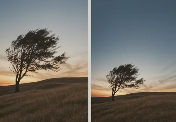
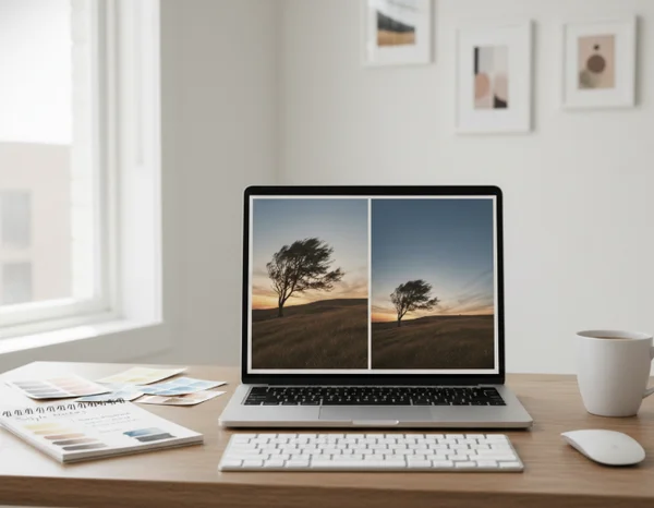
Test one photo in two ratios before judging the style
A weak result is not always a weak painting style. Sometimes the same photo looks flat in one ratio and convincing in another because the layout finally matches the subject.
That is why it helps to run one source photo through two canvas shapes before rejecting the painting effect. A square or tall crop can make a portrait feel intentional. A wider crop can rescue a scene that felt cramped.
This is one of the simplest ways to use the AI painting flow more intelligently. Ratio testing is fast, and it often fixes problems that users would otherwise blame on the generator.
Next Steps for Better AI Painting Layouts
Choosing a painting style is only half of the visual decision. The canvas shape quietly controls focus, breathing room, and how much of the original story survives into the final artwork.
That is why ratio should be chosen before style, not after disappointment. A well-matched canvas makes the next generation easier to judge and easier to improve.
When the frame supports the subject, the painting effect has a stronger base to work from. The result often feels more intentional, even when the workflow stays simple.